Surf. Simplified. Together.
Ondular is a surf app for busy people who care about regenerating the environment
ondular is a surf forecasting app that
makes planning your surf sessions simple and
brings people together to protect the places people surf.
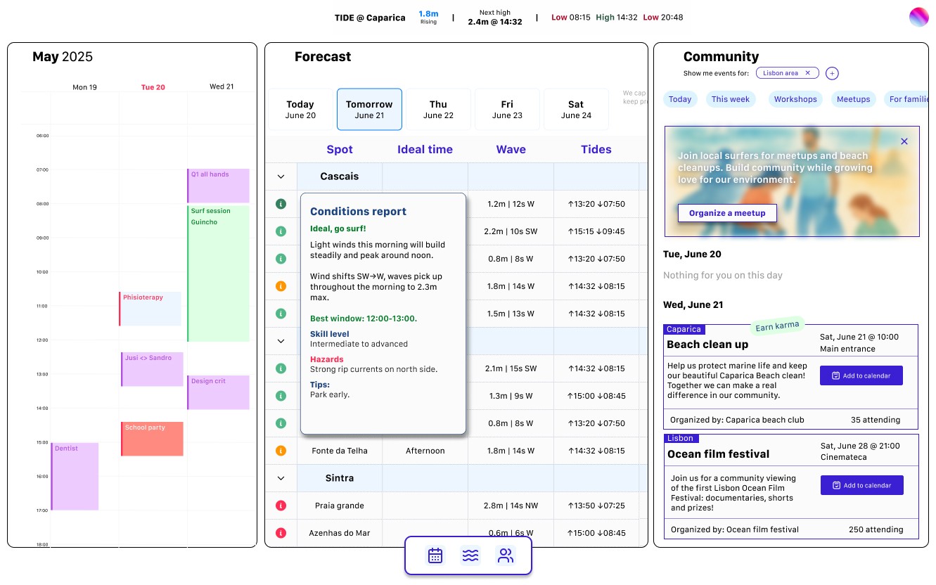
The heart of ondular is a 3 panels integrated forecast and planning system, providing users with clear surf decisions and seamless schedule integration.
The interface is designed to be both instantly actionable and socially connected, allowing users to see optimal surf times at a glance while easily coordinating sessions with their calendar and connecting with their local surf community.
The challenge
Surf forecasting is often overwhelming. Technical data, confusing terminology, and rigid scheduling create barriers between surfers and the ocean. We want to encourage our users to develop a deeper, more sustainable relationship with surfing: one that balances personal passion with community responsibility and environmental care. We also want to make the process of planning surf sessions more intuitive, collaborative, and aligned with people's actual lives. This is why we designed Ondular around simplicity, integration, and shared stewardship of the places people surf.
My role: Product designer
Tools: User research, Information Architecture, Wireframing, Prototyping, Usability testing, Design system
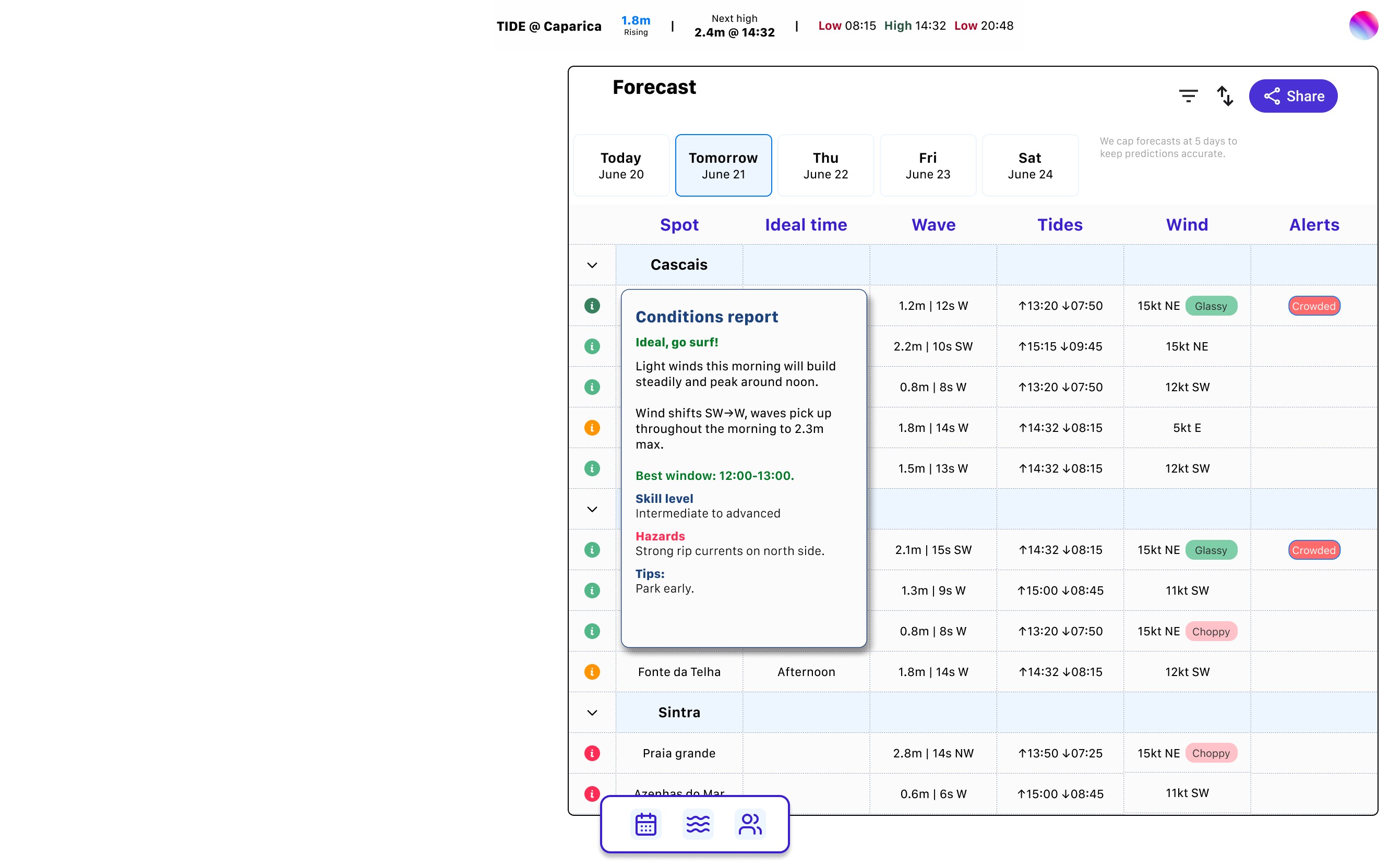
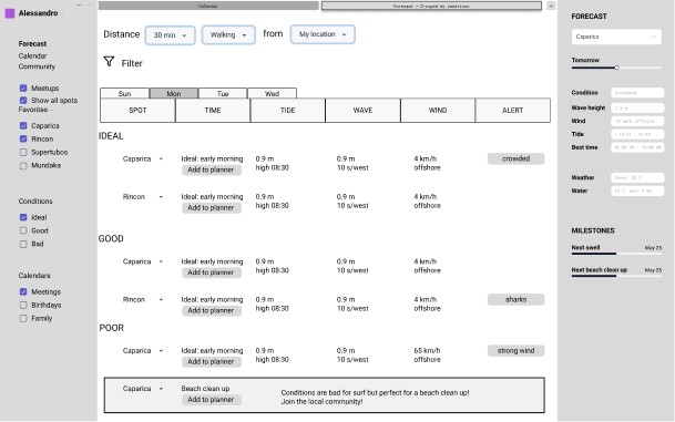
Forecast
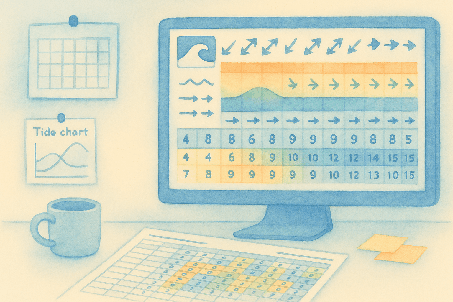
Current surf forecasting apps overwhelm users with technical data that requires expertise to interpret. Wave heights, wind speeds, swell periods, and tidal charts create barriers rather than clarity. Most surfers simply want to know: should I paddle out today?
Ondular transforms complex meteorological data into intuitive, actionable information. By focusing on decision-making, we help surfers spend less time analyzing forecast data.
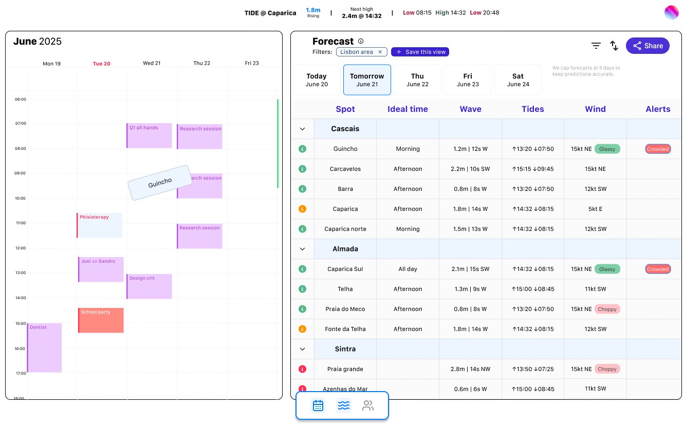
Users sync their own calendar
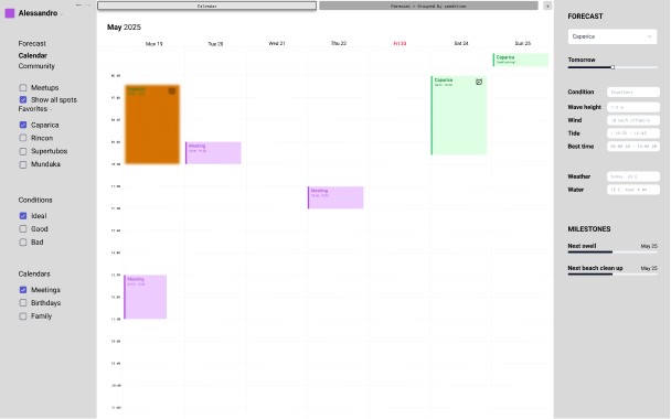
Calendar
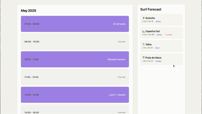
Ondular bridges this gap by integrating surf forecasts directly into your calendar system. When good conditions are predicted, you can visualize how they fit into your existing commitments, and drag and drop a spot in your calendar, blocking your schedule.
The ocean operates on its own schedule, often conflicting with modern life's rigid structure. Traditional forecasting apps show you when waves will be good, but don't help you actually plan around them.
Drag a spot and drop it in your calendar

Community
Surfing communities thrive when members engage beyond just riding waves. However, current platforms focus solely on conditions, missing opportunities to strengthen social bonds and environmental stewardship.
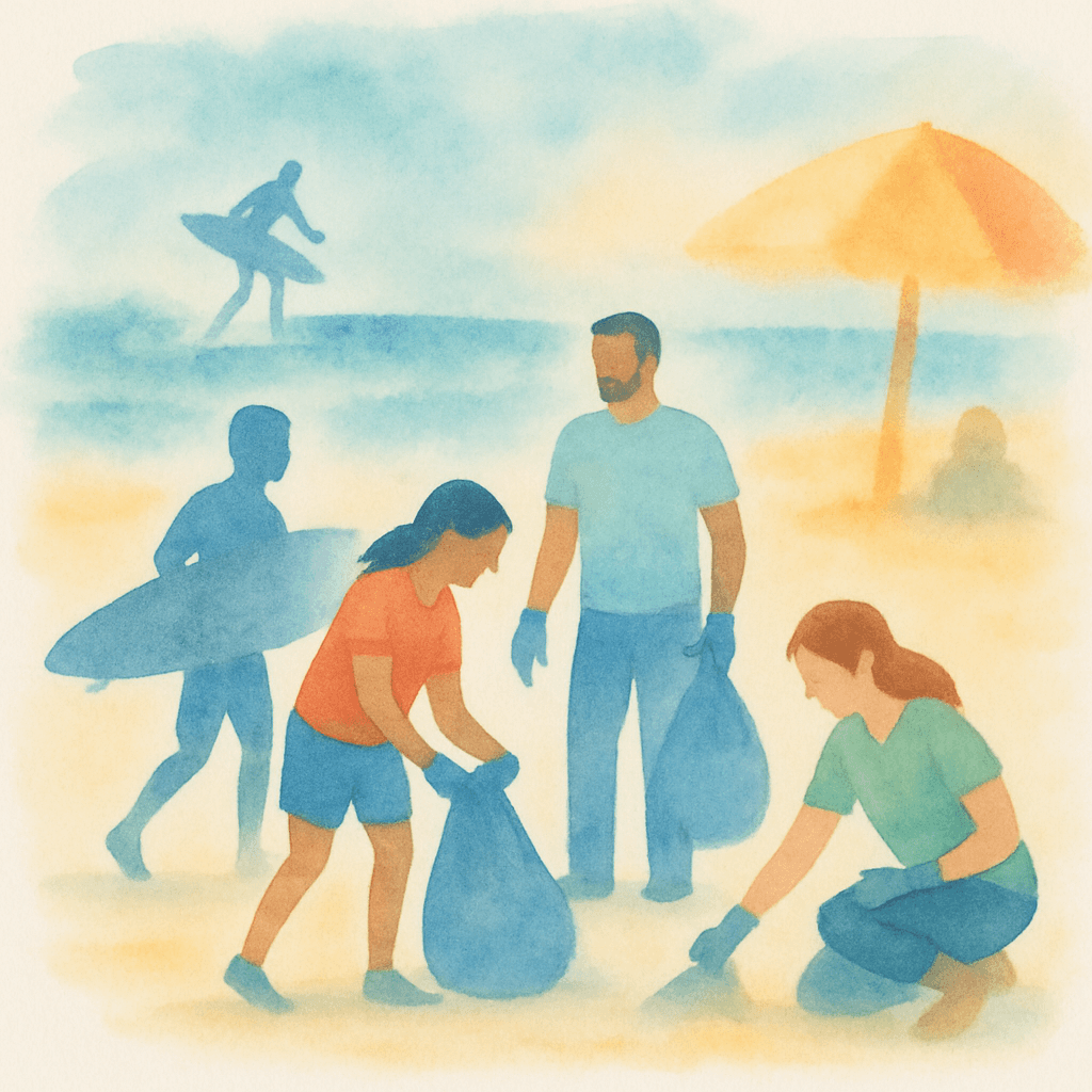
Ondular recognizes that flat days and off-seasons are when communities can make their greatest impact. By facilitating beach cleanups, skill-sharing sessions, and environmental initiatives, we create a platform where surf culture extends beyond individual sessions to collective care for the ocean ecosystem.

The process
Discovery research
Understanding surfers mental models and lifestyle
Current surf forecasting tools overwhelm users with technical data without translating it into actionable decisions. To understand this problem deeply, we conducted mixed-method research combining surveys and in-depth interviews with surfers of varying age and experience levels.
We focused on three core dimensions: process, context, and social behavior.
Our overarching research question was: why do people check weather and surf conditions?
Key Research Insights:
Information disconnect
Surfers organize their entire week around the best surfing day, but struggle to translate technical forecast data into real world conditions. Users consistently mentioned difficulty translating app forecasts to actual beach condition. Apps might show acceptable conditions, but reality differs significantly.
Community is key
Surfers rely heavily on local knowledge and surf schools for condition updates, but balance this with not wanting to bother local experts daily.
Productive downtime
When conditions aren't OK for surfing, surfers want meaningful alternatives. This revealed an underserved need for community engagement during flat periods.
A universal concern emerged around environmental stewardship
Every interview participant expressed deep care for ocean health and coastal preservation. However, existing surf applications provide no mechanism for environmental engagement or community action.
Personas and User Journeys
Translating research insights into user archetypes
We synthesized research insights into three distinct user personas representing different surf planning methodologies and community engagement patterns.
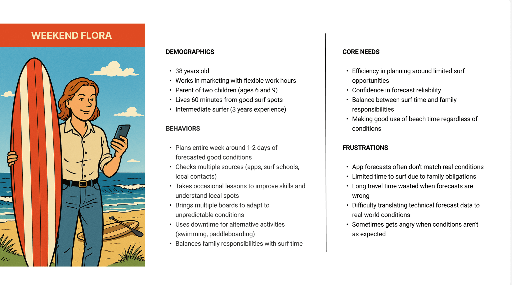
Weekend Flora represents time-constrained users who organize weekly schedules around optimal surf conditions, requiring forecast reliability and seamless calendar integration.
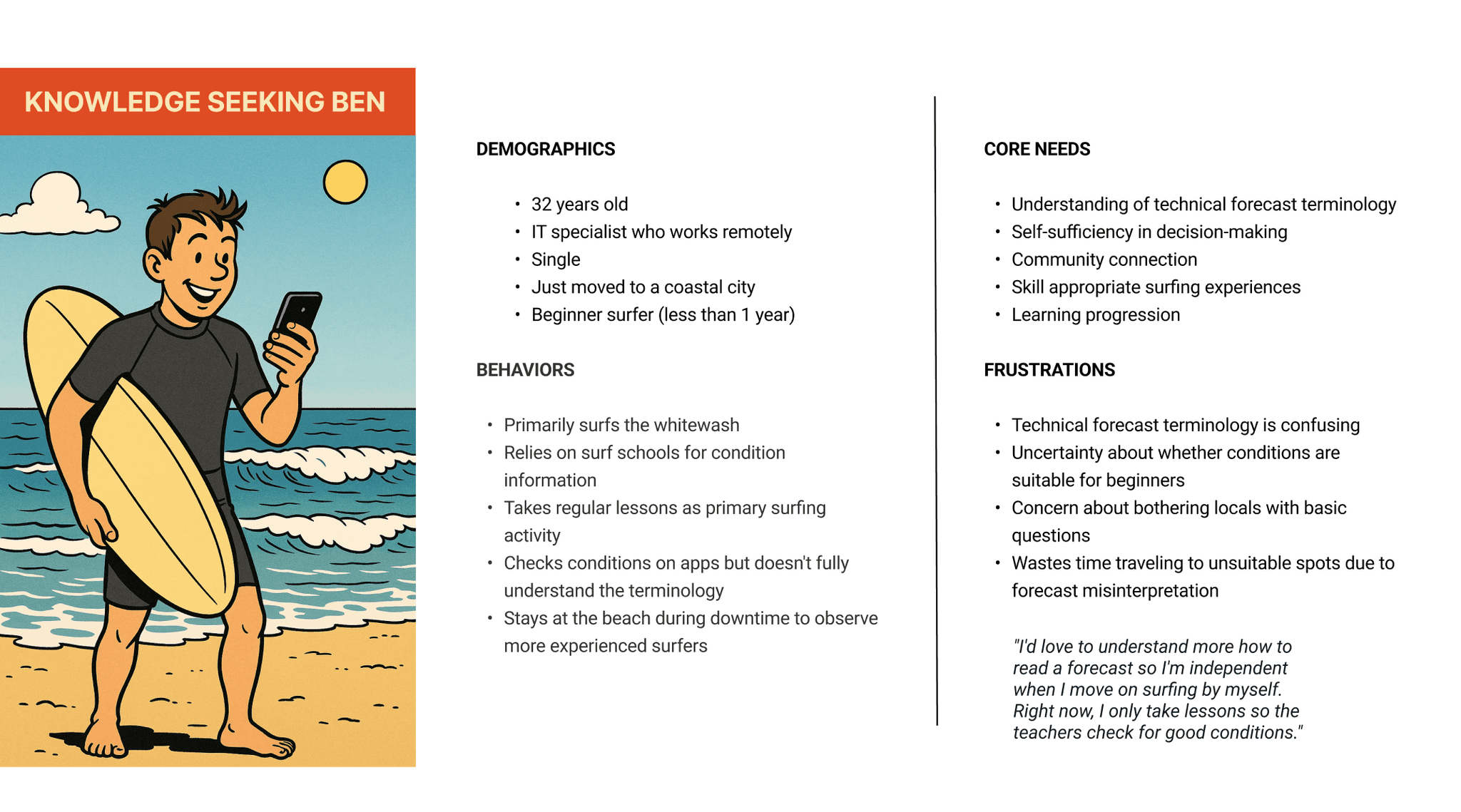
Knowledge Seeking Ben embodies eager beginners seeking to understand the forecast and wanting decision-making independence, highlighting the gap between technical data and practical safety considerations.
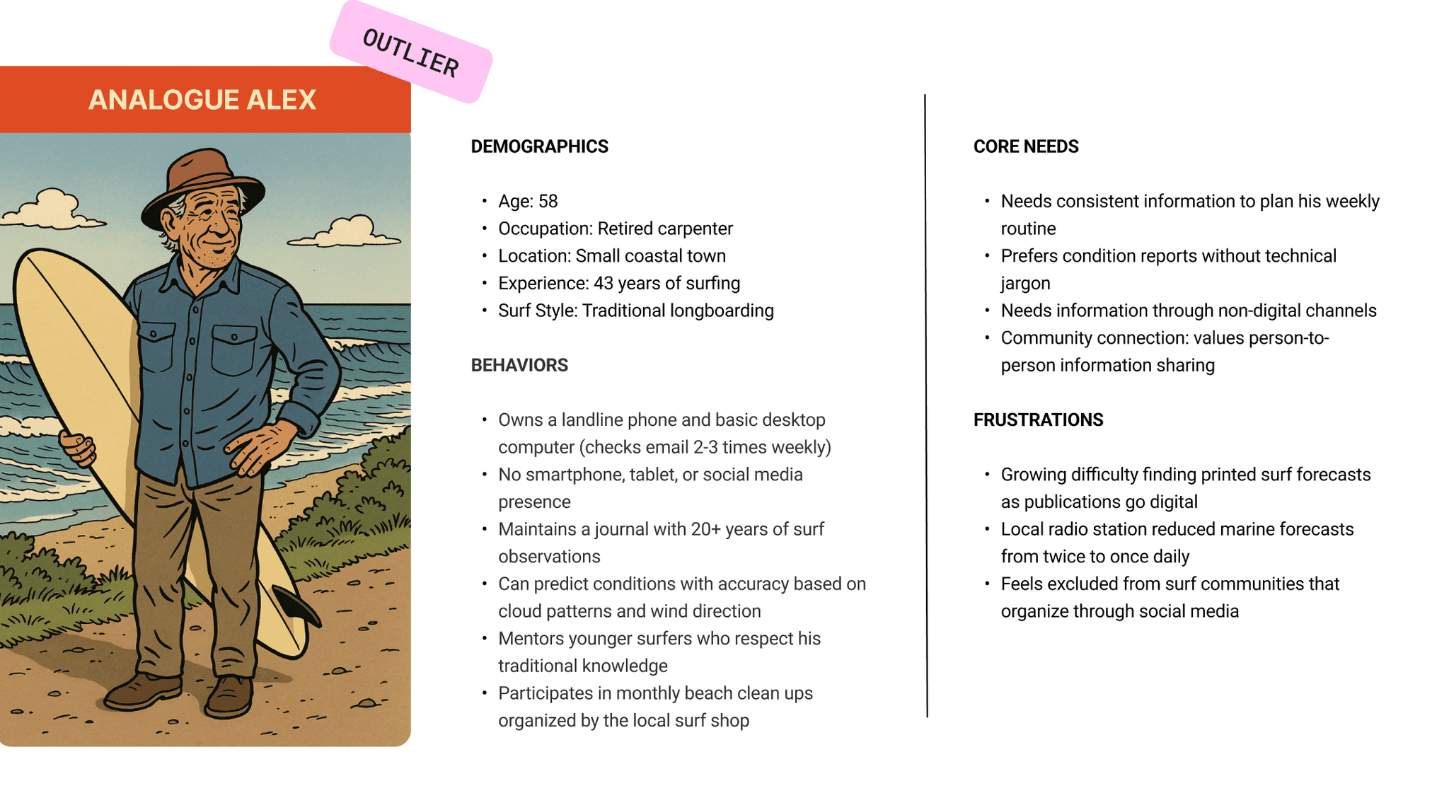
Analog Alex serves as our edge case: experienced surfers who prioritize traditional knowledge systems over digital complexity.
Comprehensive user journey mapping revealed the emotional and practical complexities of surf planning from initial forecast checking through post-session reflection. Ben's journey exemplifies the beginner experience, progressing from excitement about potential sessions to anxiety about safety interpretation.
These personas and journeys directly addressed core research findings around forecast simplification, life integration, and community connection. They provided concrete frameworks that guided feature prioritization and design work, identifying precise friction points.
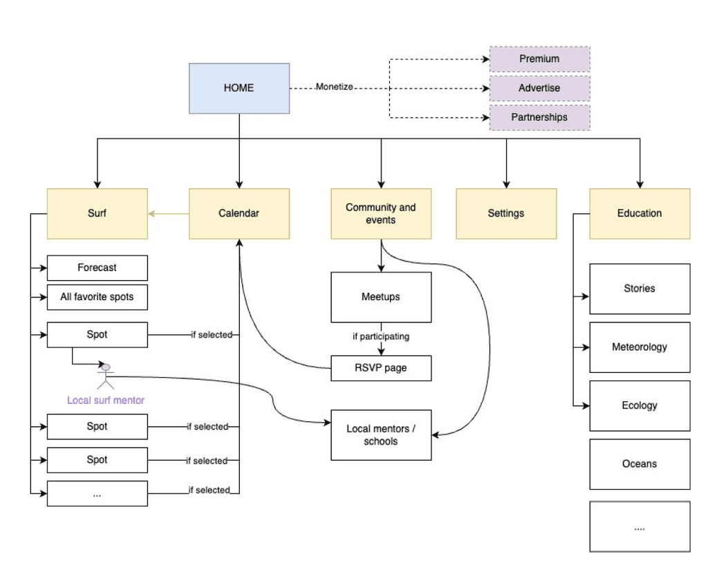
Information architecture
Structuring the user experience
We built ondular around three main sections: Calendar where forecasts connect to your schedule, Surf for conditions and spot information, and Community for meetups and beach cleanups. These three sections made up our V0. V1 might have Education to help people understand forecasts better. The key difference from other surf apps is putting calendar first.
Wireframing
Exploring layout and functionality
With the information architecture defined, we explored different layout patterns to find the optimal structure for our calendar centric approach. We evaluated multiple wireframe options against persona needs and core functionalities, weighing traditional sidebar layouts against calendar-focused designs. Through this comparison and thanks to a round of fast usability testing of the concepts, we identified the optimal solution: a flexible 3-panel interface where users can adjust modules based on their immediate needs (calendar for planning, forecast for conditions, and community for events) allowing personalization while maintaining transitions between core functions.
High fidelity
Crafting the visual identity
We created a visual system based on ocean colors and clear functionality. Primary colors (shades of blue) establish brand identity, while secondary colors handle specific functions like the green-orange-red traffic light system for surf conditions.
SF Compact typography was chosen for maximum readability and familiarity. The component library includes consistent button states, filter tags, and interaction patterns that work across all interface sections. The ocean-inspired design connects users to the environment while maintaining the functional clarity needed for surf planning decisions.
Coral pink MID
#FF6B6B
Warm orange
#FF9500
Gray
#8D99AE
Light blue
#EDF6FF
White
#FBFBFB
Sea grass green
#52B788
Sea grass green light
#DEFFE3
Fish blue
#4A90E2
Purple Sea Urchin
#8B5FBF
Purple Sea Urchin Light
#BF9FE5
Coral Pink
#FF2D55
Soft coral
#FF8A95
Main blue
#3A1FD2
Navy
#1C437E
Secondary colors used for calendar events, tags, and traffic light system for surf conditions.
These colors communicate conditions at a glance.
Coral pink alerts to caution, warm orange signals attention needed, and sea glass green gives the all-clear. Also perfect for tags and labels.
Light blue and White for backgrounds
Grey for strokes and separators
Primary colors
The primary color palette consists of the core brand colors that define the visual identity of our design system. These colors are used prominently across the UI to establish brand recognition and create a cohesive experience.
Secondary colors
The secondary color palette complements the primary colors and is used to support and enhance the overall UI. These colors add variety and depth without overpowering the primary palette.
Ocean inspired foundation.
The blues create a natural water themed progression from sea depth, to sea foam.
Considerations: it’s pretty blue heavy so it could be difficult to create distinct color categories.
Active
Active
Hover
Hover
Inactive
Share
Share
Filters:
Lisbon area
Wed Jun 21, 08:00 - 09:00
Save this view
Action tag
Filter tag
Create your first event
Show me events for:
Lisbon area
Buttons and tags
Examples
Tag
Positive alert
Alerts
Button
Button
Button
Lisbon area
Show me events for:
Lisbon area
Drag and drop interaction
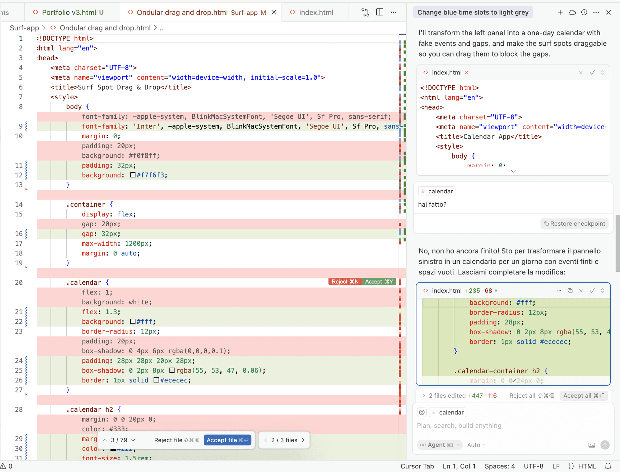
Experimenting with code using Cursor AI
The drag-and-drop functionality from forecast to calendar is one of ondular's main features, and it's representing a main benefit: it makes surf planning integrated into each users's schedule. Instead of just creating a prototype in Figma, I built this interaction with real code using Cursor. The AI agent helped with coding an essential artifact, but working in a code environment also let me learn how interactions actually work. This was much better than a basic prototype because I could experiment with the timing and feel of the drag-and-drop until it felt right. When I tested with users, they experienced the real interaction instead of a prototype: that gave me better feedback about this critical feature.
Usability testing and roadmap
Evaluating design decisions, planning future development
Usability testing revealed significant gaps between the design intentions and user comprehension across core functionality. The traffic light condition system created confusion without explain context, undermining its purpose of simplifying forecast interpretation. The AI report feature missed visual prominence, despite being positioned as a key differentiator for forecast comprehension.
Navigation issues emerged around unclear filter iconography and an overwhelming onboarding experience with excessive text and screen count.
The core drag-and-drop functionality was successfully validated. Testing confirmed our central hypothesis about planning integration as meaningful differentiation from existing surf applications.
The results were systematically categorized by impact and implementation effort, enabling strategic roadmapping.
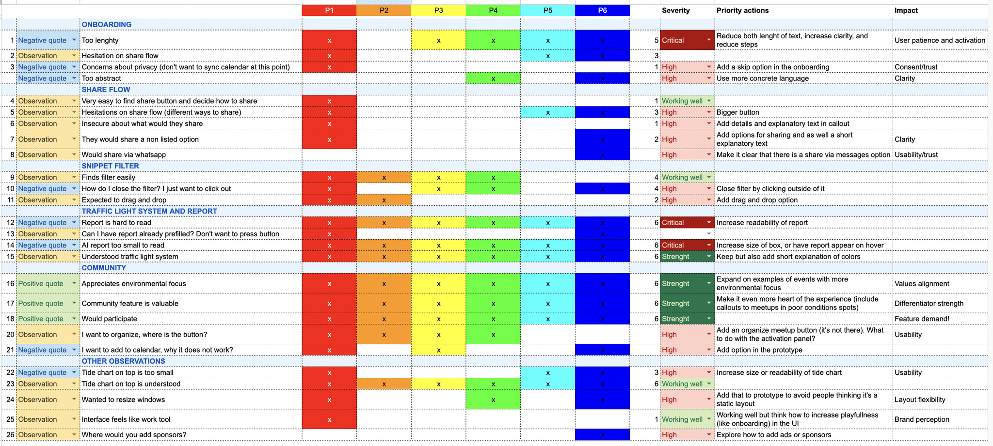
Categorizing issues and obversations across participants
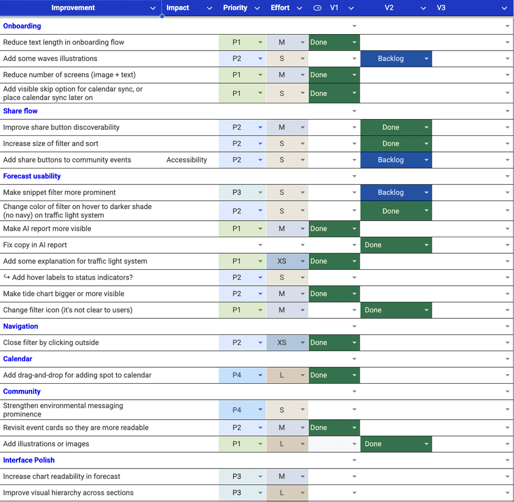
The roadmap prioritizes usability fixes through iterative releases based on testing results.
V1 addressed critical issues including AI report visibility, traffic light explanations, and onboarding streamlining.
V2 will focus on community feature improvements and interface polish.
V3 will expand functionality with advanced features like downloadable chart data.
Future phases will introduce progressive feature expansion while maintaining the forecast-planning-community integration core.
Categorizing issues and obversations across participants
Improvements roadmap